I'm Exhibiting at SURTEX 2016!

Hello! I am excited to be exhibiting at SURTEX for the first time this year! For those who don't know, SURTEX is a trade show that features artists who offer their work for license to companies and manufacturers. Here is the show info:

SURTEX 2016

Javits Center | NYC

Sunday May 15, Monday May 16 & Tuesday May 17

Anne Was Here | Booth #451

If you are an art buyer or creative director and would like to make an appointment to visit my booth, please email me!

If you are an artist that would like to meet, we will be having a meet up for Heart 2 Art one evening after the show. Heart 2 Art is a Periscope show and Facebook community that cultivates creative conversations inspiring working artists to thrive. Please check back soon for details on when and where this meet up will take place! Buyers, Directors and Agents are of course welcome to attend too!

Really looking forward to meeting everyone!

New Fabric Collection and Magazine Feature!

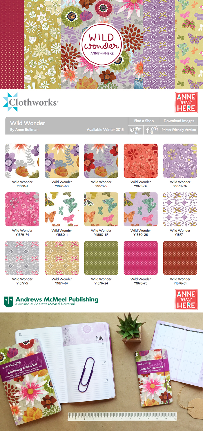
Greetings to you from a sweltering September day in Southern California! I have no air conditioning in my house and it's been a particularly hot summer here. Despite that, it's been a wonderful few months filled with a good mix of work and play. I hope you all had a nice summer too! I wanted to share my new fabric collection, Wild Wonder, which is available for preview on the Clothworks website and will be coming to quilt shops starting this winter. You can click here to see the entire collection. I also have a Wild Wonder Daily Planner and Monthly Planner available in my Etsy shop!

©Anne Was Here 2014

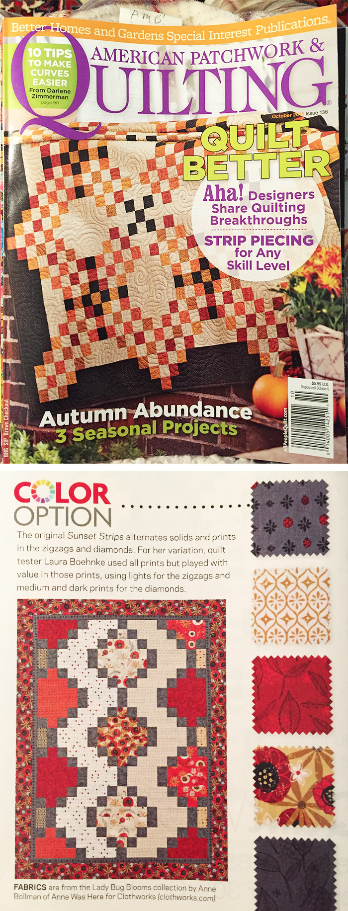
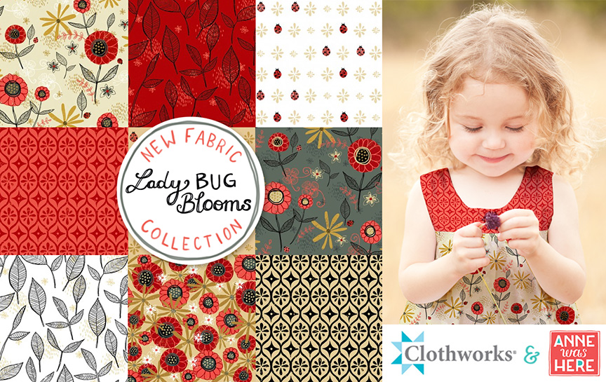
I also got some great news this week that my debut fabric collection, Lady Bug Blooms was featured in the October 2015 issue of American Patchwork & Quilting Magazine! Clothworks wrote a bit about it on their blog, if you'd like to read about it you can here.

APQ Anne Was Here

I'm Teaching a Skillshare Class!

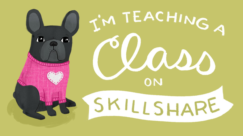
Heyo! I am so excited to announce the launch of my Skillshare class, Illustration In Photoshop: Professional Work From Your Sketches. In this class we will be illustrating our pets - what could be more fun? Click this link to watch the class trailer and see what it's all about! If you are new to Skillshare you can use this link for a 1 month free subscription to any class including mine.

TeachingASkillshareClass

My Greeting Card Line with Studio Oh!

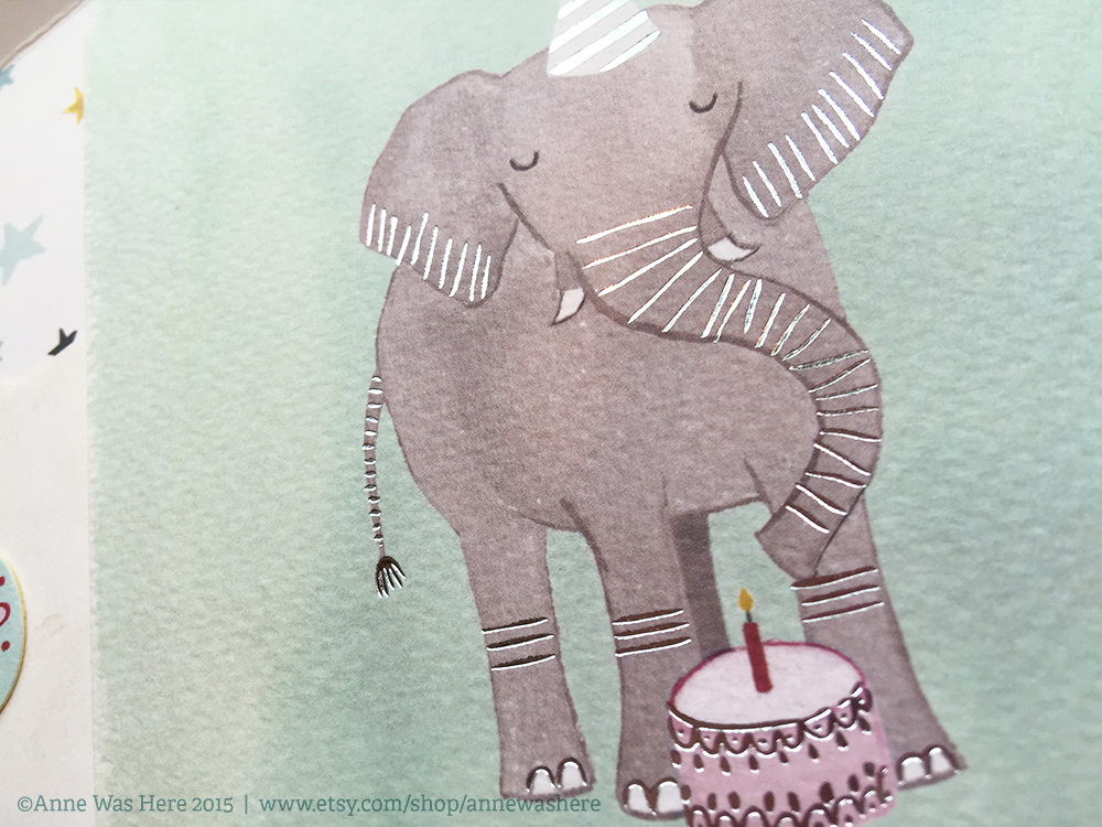
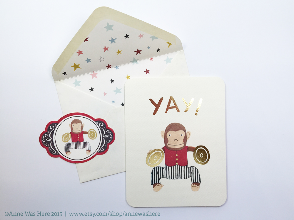
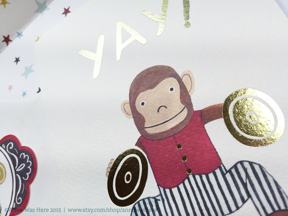
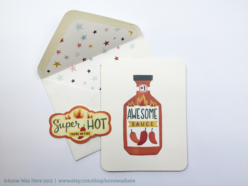
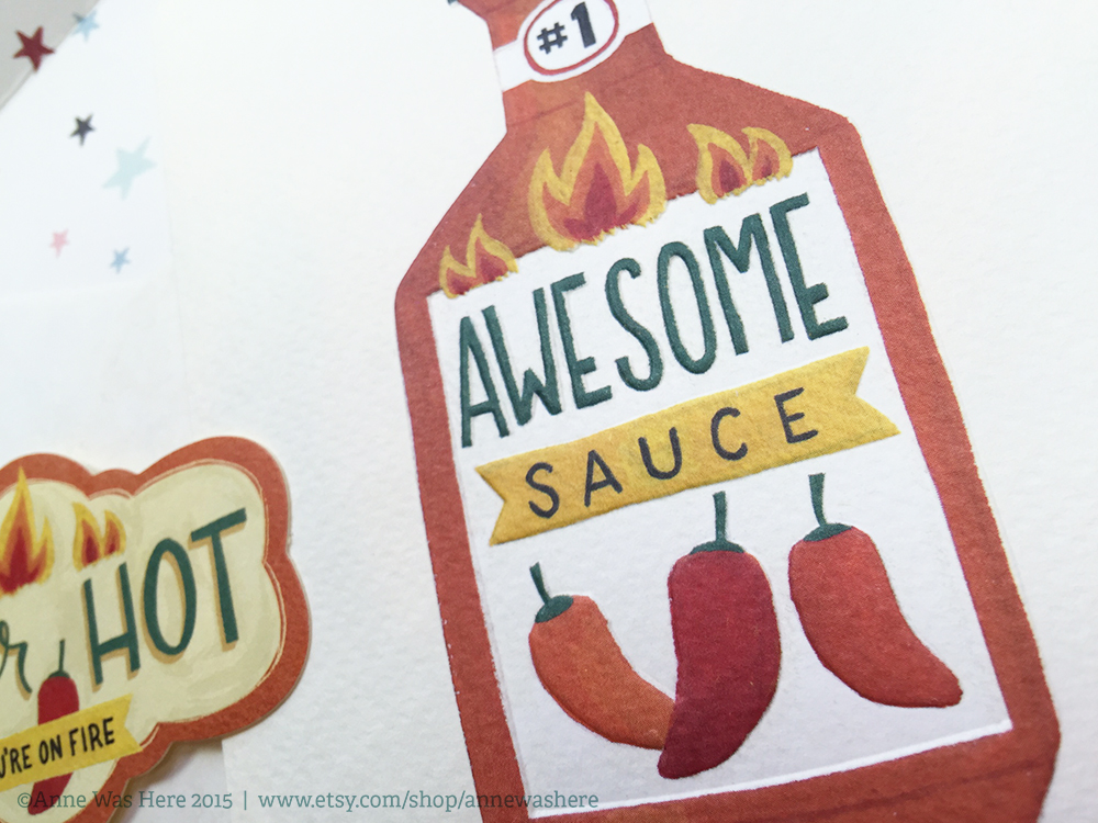
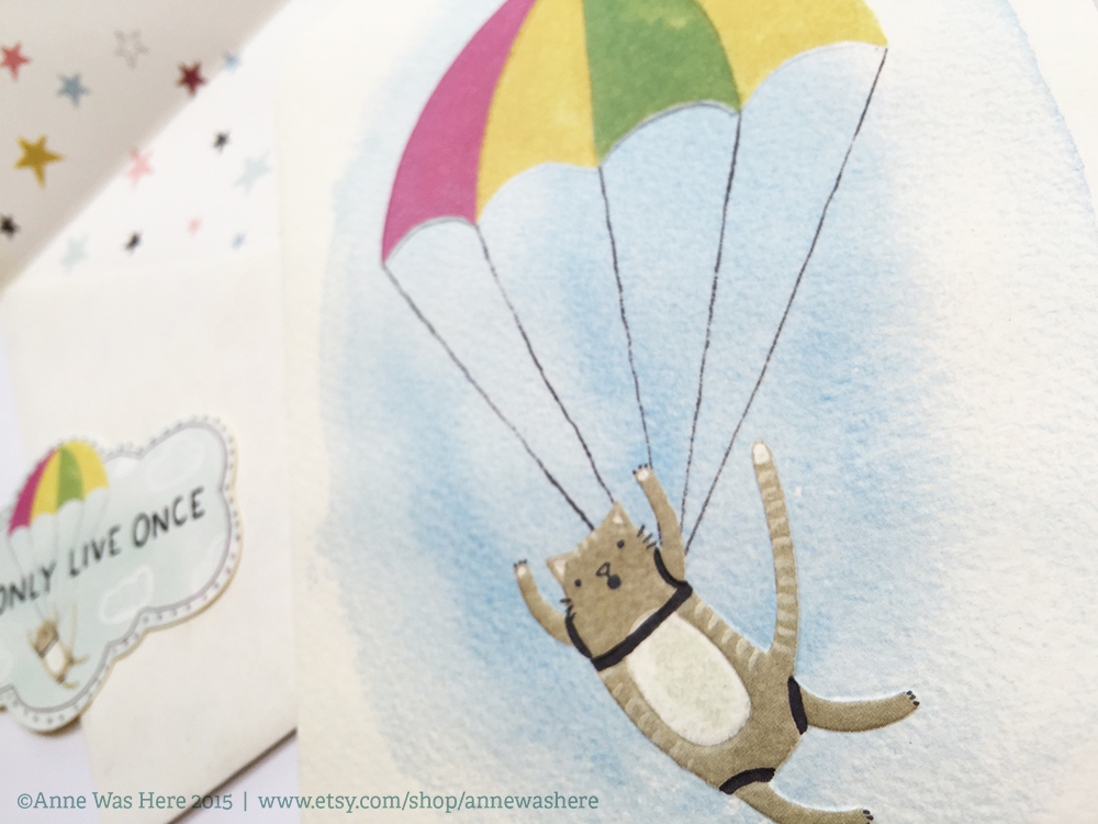
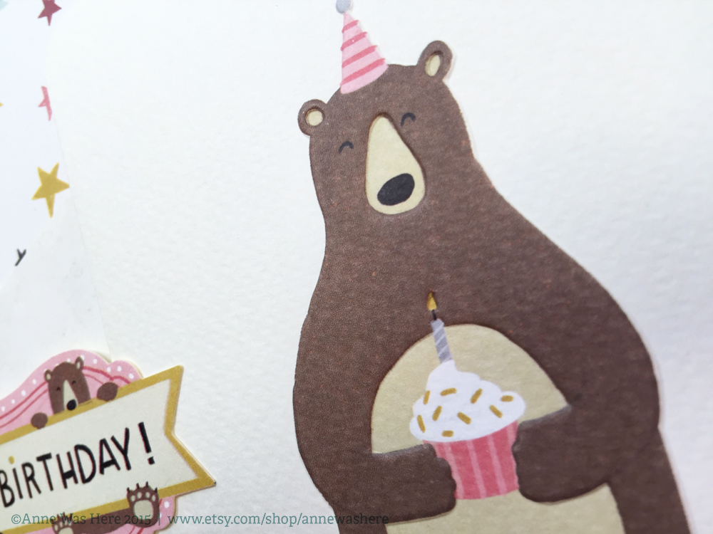
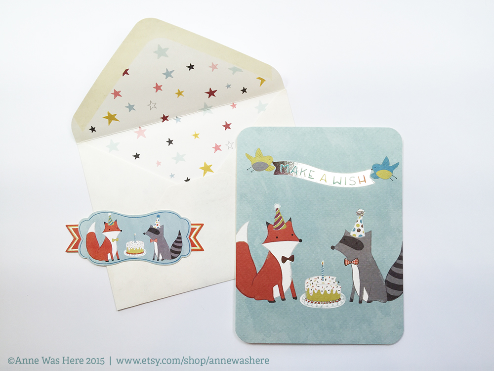
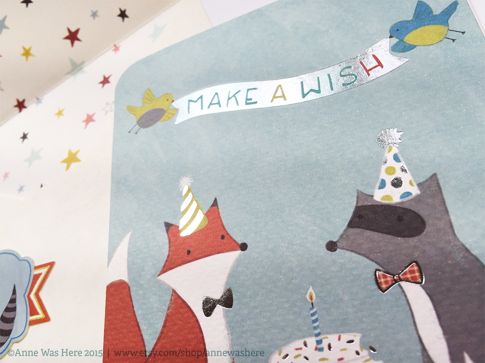
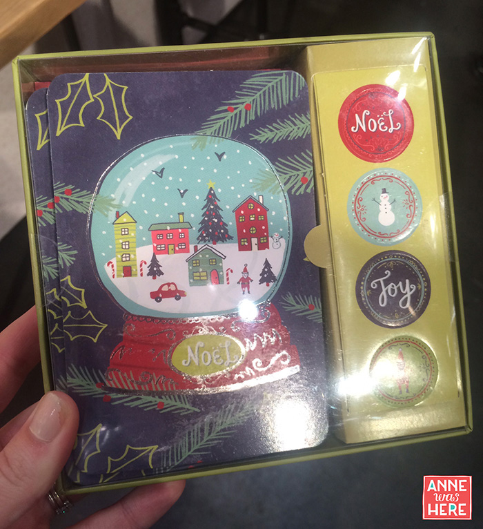
I've just added my new greeting card line with Studio Oh! to my shop. These are some fun alternatives to your standard greeting card. They are super high quality textured paper with either foil embellishments or embossing. Each card comes with an envelope and envelope seal. Hope you love them! You can get them here. xo

Anne

Elephant1_AnneWasHere Elephant2_AnneWasHere Yay1_AnneWasHere Yay2_AnneWasHere Awesome1_AnneWasHere Awesome2_AnneWasHere Yolo1_AnneWasHere Yolo2_AnneWasHere BirthdayBear1_AnneWasHere BirthdayBear2_AnneWasHereMakeAWish1_AnneWasHere MakeAWish2_AnneWasHere


Vegas Baby! | The Licensing Expo 2015 | Part 2

LE15 Wow. I just got home from exhibiting at the Licensing Expo in Las Vegas and I am equal parts exhausted, excited and overwhelmed!

I went into this show feeling cautiously optimistic because of what I have heard and read about the Art & Design section from prior exhibitors. I was told it was really small and pushed way back in the corner of the huge show floor. Both true. I had heard that the opportunity for artists was a fraction of what SURTEX provided. This I can't really confirm or deny because I have never exhibited at SURTEX and don't know how many leads/contacts are typical. I have walked SURTEX twice and talked with many of my friends who have exhibited there, so I do have a general impression of the show.

can tell you that I am very pleasantly surprised with my results from exhibiting at the Licensing Expo.

WHAT WAS GOOD

1. The diversity of the leads obtained was excellent. Part of the reason that I decided to exhibit at the Licensing Expo was that I had an inkling that I would find more diversity in the type of contacts I made. This turned out to be so true. Here are some of the categories that I walked away with strong leads for:

-Agents: Art, Brands, International -Lawyers: Contracts & Licensing -Custom Manufacturers & Printers -App Creators: Gaming & Educational -Animators: Major Networks & Small Collaborative Shops -Apparel: Fashion, Shoes, Pajamas -Fashion Accessories -Toys -Stationery, School & Office Supplies -Gift -Publishers -Wall Art -Wall Covering & Decals -Balloons -Fabric -Jewelry -Housewares & Ceramics -Home Decor -Pet Products (yay!) -Games & Puzzles -Craft & Hobby -Flooring -Garden & Outdoor -Calendars -Car Stickers -Greeting Cards -Tech Cases -Freelance Design Opportunities

2. Major players were at this show. Many of the contacts I made were with companies that are very difficult to get in touch with otherwise due to their size, scale of business and/or prestige. Companies that are there to do big branded licensing deals stopped by to consider working with the small guys like me. Woot!

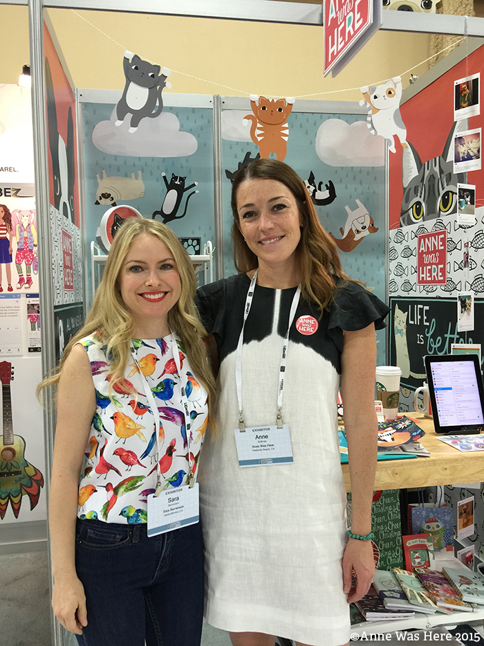
3. Because the Art & Design section is small, there is a great opportunity to stand out. For instance, if ABC Company is looking for a watercolor artist, like my talented friend Sara Berrenson, her booth was the only one that was decked out wall to wall with watercolor art. So you better believe ABC company stopped to talk to Sara! And if XYZ Company was interested in cute cat and dog art, my booth was impossible to miss.
SarahAndAnne_AnneWasHere

Above: Sara Berrenson and me. This was day 3 so forgive me for looking tired. Below: Sara in her gorgeous booth!

SarahB

4. The Launch Pad booths for new exhibitors are very reasonably priced. These booths are a fraction of the cost of any booth you can get at SURTEX, however, they are also a fraction of the size! I had several people even comment that they liked the condensed booths and thought they were less overwhelming to take in. A SURTEX representative stopped by my booth and we discussed this very issue. I mentioned that I think the cost for an artist just starting out to exhibit at SURTEX is very restricting. He said that they were aware of this and are working on a potential exciting new option (read smaller less expensive option) that they hope to launch ASAP.

EmptyBooths

Above: The Launch Pad Booth as provided.

5. The on site customer service was very good. Unfortunately my booth panel layout did not match the drawings I received, even though I confirmed in writing that they would! Fortunately, each booth comes with an on site service contact who I called and she had my panels swapped out within an hour. So all was forgiven. :)

6. I already mentioned that the Art & Design section was way in the back corner of the show. To help mitigate this, the show planners had some live action painting/entertainment in our section which drew quite a crowd each day. I always had interesting visitors that I wouldn't have otherwise after one of these events.

7. There was a lot of opportunity for free press. I submitted content for as many of the opportunities as I could and had my logo on emails and flyers that went out and even had an article in one of the show dailies, a daily publication by License Global Magazine, which were handed out for free at the show. There was also a "One To Watch" contest which was open to anyone to participate. My friend, Antonija, won with her amazing property, Lil Ledy. So exciting for her and very cool!

LicenseGlobal_AnneWasHere

Above: My press in the License Global Magazine Show Dailies Below: Antonija and Sonja with their winning Lil' Ledy property.

LilLedy

WHAT COULD HAVE BEEN BETTER

1. It was not easy to make contacts and set appointments with attendees prior to the show as a first time exhibiter. The show management had a "free" matchmaking service for artists, but no matches were made on my behalf even though I engaged their service months in advance. I was offered some services that I could have paid for. Also, lists of potential attendees were offered for thousands of dollars, but that doesn't help an independent exhibitor. I had to rely on my existing contact list and hope that some of them would be attending the show. That doesn't really help when you also want to meet new contacts and everyone tells you making appointments is key.

2. The move-in and move-out options were not clearly laid out for a new exhibiter. Maps of where to park and load were very vague. The parking structure was too far from the show floor. Not a big deal if you can afford to have all of your booth furnishing shipped and dropped for you (two separate costs), but for someone like me who hand carried everything it was a 10-15 minute walk through the casino into the convention center. It took me 4 trips each way so we're talking hours of carrying heavy loads! They did have a closer (note that I said closer and not close) unloading area but you can't use it if you are operating alone. Lesson learned - don't do this show alone even if your booth is tiny! I was lucky enough to have a friend help me after the show was over and she cut my move out time in half. Thanks Vivayne!

3. If you follow me you know that I have had frequent problems with my art being ripped off, particularly internationally. This is a big international show. They have a policy that people are not allowed to take pictures or video without permission. Each day many people took photos of my booth, particularly my peeking dogs, without my permission. When I would ask them for a business card they said they didn't have one and most of the time their badges were turned over so that I couldn't even see who they were. I would have appreciated better enforcement of the no photo policy, as this situation made me very uneasy. I was happy to let people take photos who were genuinely interested in my work and were transparent about who they were.

WHAT I WAS GLAD I DID

1. I spent a lot of time and energy planning my booth design. Having a good display can make or break you at this show! If you don't draw people in within seconds they will walk right by. And you are competing with some really big budgets for attendees attention! There are some unbelievable displays at this show. I created an elevation, floor plan and 3D model of my booth before I printed or ordered anything so that I could see what it looked like. For the 3D model, I just used a drawing that was provided to me and mocked up my banners and furniture on top of it.

BoothDesign_AnneWasHere

2. Because it was so small, I decided to theme my booth instead of showing a variety of my design capabilities. This was risky because I was worried some people would pass me up if they aren't interested in pet designs. That may have happened, but I think even more people who wouldn't have stopped did because they loved my cats and dogs. Also, showing my ability to create characters at a highly character driven show like the Licensing Expo was a strategic move to draw in bigger opportunities.

FatCats_AnneWasHere

3. I brought lots of samples of existing licensed products. I got feedback that people really liked to see that I was experienced and that I know how to design art for products. I bought an inexpensive and easy to assemble shelf from IKEA to display the samples.

Shelf_AnneWasHere

4. Even though my feet are paying for it now, I am glad that I stood almost the entire show and engaged people as they walked by. I got some really promising contacts by just talking to people who would have otherwise kept going. Many of them would slow down to admire my booth, but didn't really understand that I license my art to companies like theirs. When I started talking to them, we would often realize an opportunity was available to work together in some capacity.

Rug_AnneWasHere

5. I knew my elevator pitch going into the show. I had dinner with an artist friend, Jeanetta Gonzales, the night before the show and was joking that I didn't have my elevator pitch ready. Later I realized that I did. Earlier this year, I had gone through an exercise to come up with my brand statement. I revisited what I had written and it gave me the clarity I needed to talk about my brand. You'd be surprised how many people asked the simple question, "So, what do you do?" or "Tell me about your brand." I was ready to answer that!

6. I came prepared with lots of tools! In addition to all my booth decor, I brought a ladder, a vacuum, tape, duct tape, scissors, extra paper, sharpees, extra command strips, string, tools, notebooks, a stapler, hand sanitizer, water and snacks. No one else in my row had a ladder and most of them ended up borrowing mine at some point because the show was pretty strict about not standing on chairs.

7. I was really fortunate to make friends with my neighbors! Everyone close to me was very lovely and kind. They were always ready with help, advice or to cover my booth during a necessary break.

TheLaunchPadCrew

Above: Our row of Launch Padders! From left to right: Jay's Daughter Publishing/Lil' Bit, Sara B., The Tipsy Artist, The Magic Poof (Stephen), Emily Elizabeth's Designs, American Posterity/Corpirate, The Magic Poof (Chris), and Anne Was Here.

WHAT I COULD HAVE DONE BETTER

1. I should have brought more flyers. I had half page flyers printed at Moo.com and they turned out amazing! I was really happy with them, but I only had 50 printed which wasn't nearly enough. I ended up having to have more printed at the local Kinkos and they weren't nearly as nice and yet they were 4 times as expensive!

2. I had my business cards, my give away buttons, my flyers, my look books and my ipad portfolio. I wish I had created a take away brochure, something in between my flyer and my look books, for serious opportunities. A few people thought my look books were for the taking and I had to awkwardly tell them they couldn't keep them! Oops. Most people were more interested in looking through my physical look books than my ipad portfolio. I'm glad I brought both, so that when there was more than one person at my booth they could both look at my portfolio. But next time I think I will print two copies of my look books as well.

Table_AnneWasHere

3. Next time I need to find a way of communicating what kind of partnerships I am looking for within my display. You can't assume that because you are in the Art & Design section, full of art for licensing, that everyone that walks through knows that you offer your art for licensing to manufacturers and beyond. The show is so big and diverse, people don't know what every booth is after.

4. I mentioned earlier that I intentionally showcased my pet designs show my ability to create characters. Well while I think it worked in bringing in additional interest, when people asked me to describe my characters (names and story), I was at a loss for words. I realized that if I do this show again, it could be really powerful to have designs that are fully developed into fleshed out characters.

5. Next time I will bring lighting for my booth. Both of my neighbors on either side had their booths lit. They used clip on, battery powered, lights from Home Depot that were fairly inexpensive and did the trick!

Booth_AnneWasHere

6. I should have had someone there specifically to help me out in my booth. There isn't really room for two people, BUT, I was a prisoner to that booth. Even though my lovely neighbors offered to watch it for me if I left, they didn't know my brand enough to be able to talk about it for me when I was gone. Having someone there who can cover for you and knows your elevator pitch and what you're after is priceless. Because I didn't have that, I not only didn't get to leave for lunch, but I also missed opportunities to interview for free press and to walk the show and hand out my information to other exhibitors that I could potentially partner with. Also, and most importantly, I missed the opportunity to meet and have my picture taken with Grumpy Cat. So there's that.

I am really happy that I took the chance to exhibit at the Licensing Expo! It's really opened my mind to all of the opportunities that exist in this industry for creative professionals. I hope you enjoyed my recap and please feel free to leave a comment or question and I will try to respond to each one.

- Anne


2015 Surtex & National Stationery Show Recap

Even though I decided to exhibit at the Licensing Expo instead of at Surtex this year, I was lucky enough to be able to attend Surtex 2015 which is co-located with the National Stationery Show and ICFF (furniture design show). Before attending, I worried about the costs involved and whether it would be worth it to my business. Coming from Los Angeles it's an expensive trip. I knew it would be a blast to see my design friends and also very inspiring, but wanted to make sure that it was a smart investment for me. IT WAS. I am excited to come back next year, hopefully as an exhibitor. The main reasons I think it was worthwhile to attend are, INSPIRATION, TREND SPOTTING and NETWORKING. Surtex

Aisles

NSS2015

INSPIRATION

I try my best to be inspired in a more general than specific way. There is a fine line between being inspired by someone or something and imitating or copying. I was inspired at these shows by the creativity of my peers. It lights a fire in me to be better and more creative in my own work. Instead of being inspired to imitate, I want to be inspired by others success in being original and going down their own path. While I wish I could share more of what inspired me with you, taking pictures of booths and/or products is not allowed on the show floor without the designer's permission (understandably!). I did find this awesome blog post that has compiled some inspiring NSS booths, with permission, from instagram posts. Click here for part 1 and here for part 2.  I'll also be mentioning many of the Surtex designers and artists who's work I found inspiring and include links so you can check out their websites. Many of them will post photos of their own booths so you can see them that way. The Louie Awards (for cards) and the Best New Products exhibit, were open to the public so these are snapshots of some of those inspiring designs. Click on the images to link to the designer websites.

LOUIEAWARDS

LADYFINGERS

FINCHHARE1

FINCHHARE2

FIGGYPUDDING

EMILYMCDOWELL2

EMILYMCDOWELL1

HALLMARKCARDS1

NOTEWORTHY

QuillingCard1

QuillingCard2

For the record, this sympathy card by Anemone made me cry. Crazy dog lady.

AnemoneLEtterpress

BETSYOLMSTED

THEPUDGYRABBIT

PaperLove

TREND SPOTTING

Visible Artist's Hand

This one has been strong for the last few years but continues to gain momentum. There was a lot that was hand painted, hand crafted and work that was evocative of the artists spirit. August Wren's gorgeous paintings are a perfect example of this.

©August Wren 2015

3 Dimensional Elements

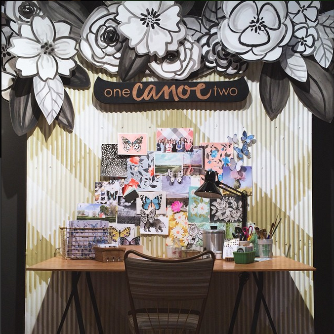
I noticed a lot of art and products with something extra to give it more dimension. I saw art that used collage and mixed media, stationery with new and interesting embellishments, and on booths a lot of paper cut and folded flowers like these from One Canoe Two.

Screen Shot 2015-05-20 at 5.27.25 PM

Modern Takes on Maps

Vintage maps have been around in design but I saw a lot of designers doing there own modern take on maps, whether illustrated or done more graphically. This was exciting for me because I am amidst a huge map project that I can't tell you about just yet but will share once I can!

Faceted Geometrics

This trend was especially strong at ICFF in home decor. I think that means we will be seeing more of it incorporated in the art shown at Surtex next year.

img37o

Combining Old and New

Ephemera and the vintage look is always present in design, but I am noticing a trend of making it fresh by contrasting it with something very new. I saw cards with vintage etchings paired with contemporary slang and ephemera collaged with bold and graphic florals.

Black & White

There is something striking about the simplicity of an all black and white design, and these were evident throughout the shows. Often times translated through artists brushstrokes, like this one from Ashley Goldberg.

©Ashley Goldberg

Fashion Illustration

I first noticed the increasing popularity of fashion illustrators on Instagram. There also seemed to be more artists at Surtex promoting their fashion illustrations than last year, and this trend was also seen at NSS. I'm digging the fresh take that some artists are bringing to the table like this one from Monica Lee.

©Monica Lee

Pin-Up Ladies & Bathing Beauties

I saw a lot of illustrations depicting vintage, full figured ladies. Some were pin up girls and others were bathing beauties like these for Windham Fabrics by Mirdinara.

©Mirdinara

Treats 

Sweet treats continue to be a popular subject matter for art. I saw Ice Cream, Popsicles, Lollipops and Donuts, which was pure torture on the floor. Here's some ice cream from Kristin Nohe!

©Kristin Nohe

All Indigo

This gorgeous trend is rampant in home decor with hand dyed textiles on furnishings and vintage ceramic tiles in blue. It was also seen throughout Surtex.

Houses & Buildings

Quirky and whimsical illustrations of houses and buildings were spotted throughout the shows.

Beyond the Butterfly: Insects

Butterflies will always be a staple in design, but I'm seeing more and more insects creeping in (pun intended). Artists who find a way to make them beautiful instead of creepy are rocking this trend.

New Metallics: Rose Gold & Copper

Every friend of mine engaged in the last year has a rose gold ring, so I should have seen it coming. While gold is still prevalent, rose gold and copper gave a fresh look to home decor at ICFF.

Pets

Dogs and cats were everywhere at Surtex and NSS and I even saw some incorporated into home decor at ICFF. Good for me because pets are my favorite thing to illustrate! Here is a dapper dachshund from one of my collections.

Doxie_AnneWasHere

NETWORKING

Attending Surtex and NSS is an amazing networking opportunity. I was able to meet face to face with many of my friends, colleagues and clients for the first time and also make exciting new connections. Being friends with other artists and designers may not seem very important for your business, but from personal experience I can tell you it has been INVALUABLE to me. I have learned more from my friends in this industry than I have from any class. They also offer a means of support and feedback in a business where many of us are quite isolated working from home. Here are some of the amazingly talented artists I am lucky enough to know!

Emma Schonenberg makes amazingly intricate patterns and I got to visit with her in her agent, Brenda Manley's booth.

EMMAANDME

On Monday evening after the show there is a free happy hour for Surtex exhibitors and attendees. It was so great getting to visit with these ladies I have become great friends with over the last two years! From left, Ohn Mar Win, Victoria Johnson, Claire Lordon, Jo Chambers, Me and that's Rachael Schafer in front.

GROUPSHOT

Ohn Mar Win is a fabulous artist with a flare for food illustration. Check her out, she's amazing.

OhnMarMe

Nicole Tamarin is a new friend who I got to meet in person for the first time. I hung out with her in her booth and got to see her in action. She is so professional and knowledgeable about her business! I should also mention that all of her beautiful work is hand painted in unbelievable detail. I heard a client tell her that she is a "diamond in the rough" at Surtex.

NicoleTamarin

Just look how cute the ladies from Happy Happy Collective are! I met Emily Balsley last year at Surtex and got to meet Jill Howarth and Tammie Bennett for the first time this year. I've been following them all on social media for a few years and am such a fan of each of them. They are a super creative bunch and had photo props at their booth! Don't ask me why I'm crouching for no reason in this photo.

HappyHappyCollective

I was lucky enough to spend a lot of time with my dear friend, Victoria Johnson. She is such an inspiration to me. I mean, just look at her booth - it is INCREDIBLE. She was nice enough to let me share this snapshot of it. She is represented by the fabulous Jennifer Nelson of Jennifer Nelson Artists who I also had the pleasure to meet in person for the first time.

VickyMe

VictoriaJohnsonDesign

A few other artists I was excited to meet, but didn't get a picture with were Elizabeth Olwen, Monika Forsberg, Kathy Weller, Tracy Mattocks, Hilli Kushnir and Este Macleod. Be sure to check out their amazing work.

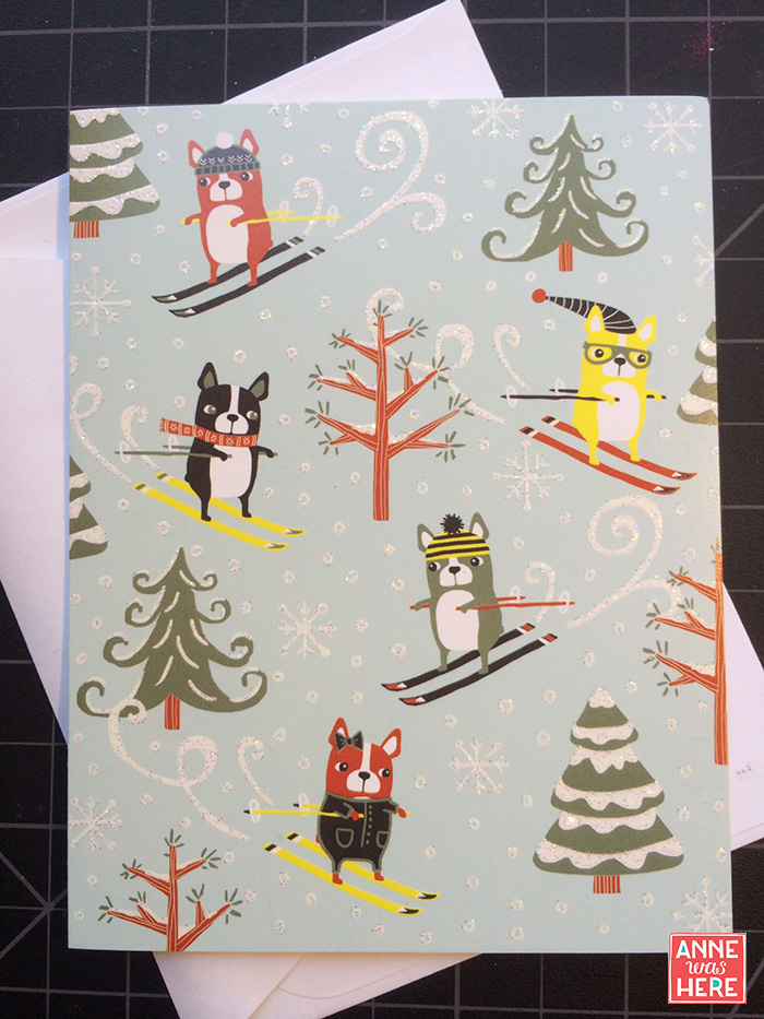
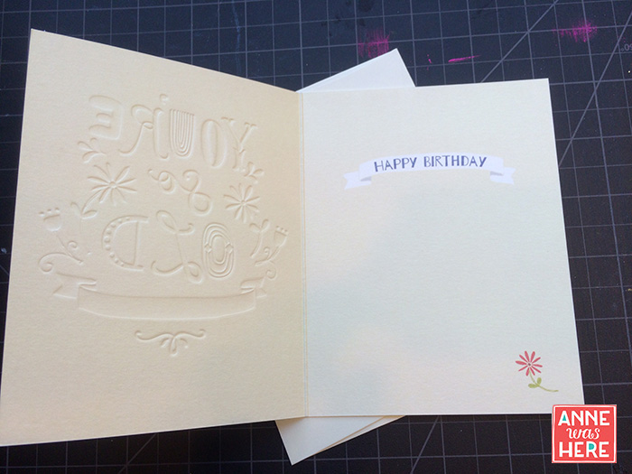
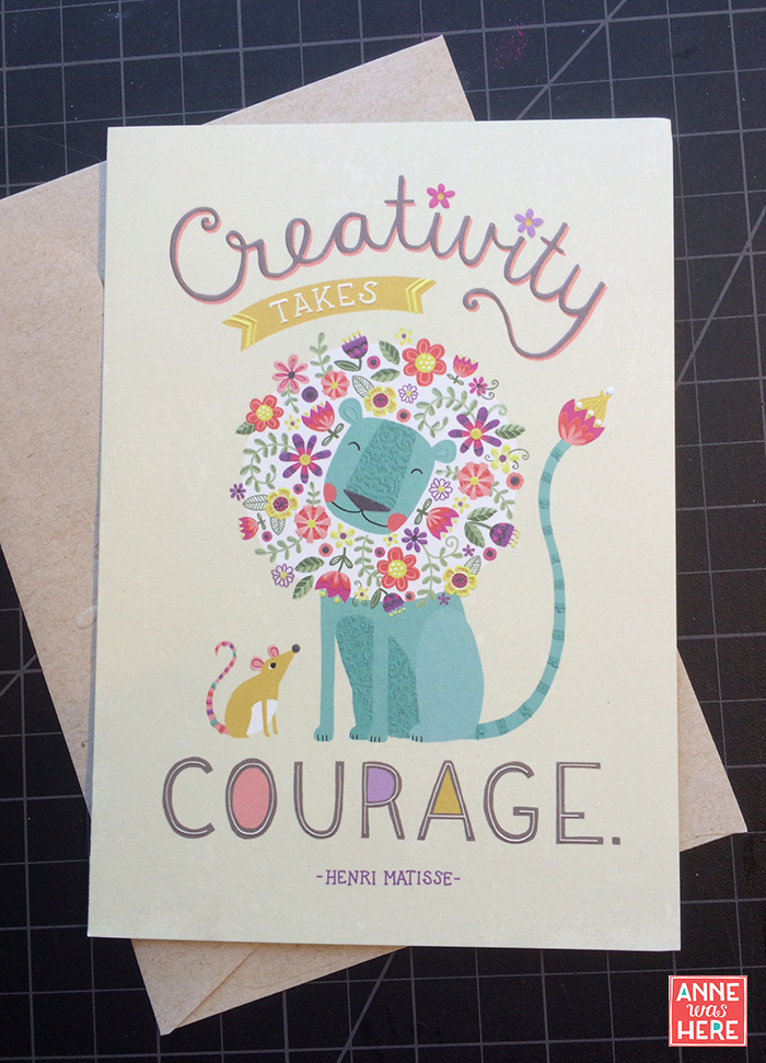
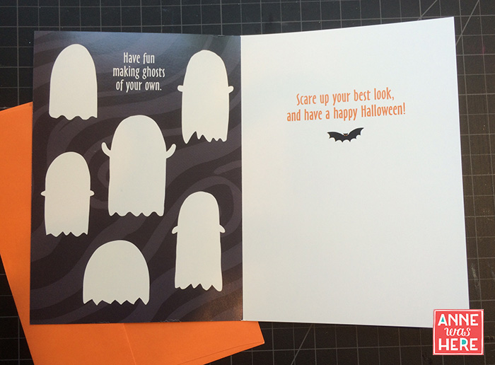
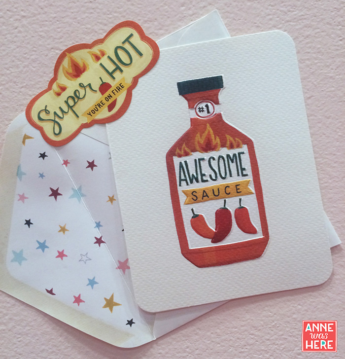
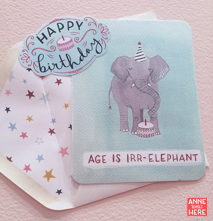
I was also able to meet with some of my existing clients and potential new ones. Here are some samples of my work that I received from the lovely people at Design Design. These cards all have such cute embellishments from glitter to embossing and the last one even glows in the dark!

BostonTerrierSlopes_AnneWasHere

YoureSoOld1_AnneWasHere

YoureSoOld_AnneWasHere

SantaBike_AnneWasHere

CreativityLion_AnneWasHere

HipsterGhosts_AnneWasHEre

HipsterGhostsInside_AnneWasHere

HipsterGhostsGlowInTheDark_AnneWasHere

I had the pleasure of meeting with the wonderful people at Studio Oh! / Orange Circle Studio and got to see my work on display in their booth. I have a new line of cards out with them and they even put my art on the cover of their Christmas catalog! I also met Becca Cahan, who has various products with them including a new line of cards as well. Hers are the ones in the row second from the top. She's great! I've got more exciting stuff coming out with them soon which I will share once I can.

The lights are intense in the booths at NSS! Good for cards, not great for my face.

StudioOhAndMe_AnneWasHere

StudioOhCards

StudioOhCatalog

YoloKitty_AnneWasHere

YayMonkey_AnneWasHere

BirthdayBear_AnneWasHere

AwesomeSauce_AnneWasHere

AgeIsIrrelephant_AnneWasHere

MakeAWish_AnneWasHere

SnowGlobeHolidayCards_AnneWasHere

InspiredTravellerNoteCards_AnneWasHere

An unexpected but welcomed contact I made was a lawyer for Copyright Armor who helps protect artists' intellectual property while saving them time and money! Um, where do I sign up?? We talked about my recent copyright issues and I'm hopeful that they can help me.

In summary both shows were fantastic and I highly recommend attending or exhibiting if you are an artist who is ready. Can't wait for next year!

I hope this recap was interesting and insightful to you! Please let me know what you think, I'd love to hear your comments about the show.

-Anne


Vegas Baby! | The Licensing Expo 2015 | Part 1

LicensingExpoAnnouncementFull_AnneWasHere I'm excited to announce that I will be exhibiting at the Licensing Expo in Las Vegas on June 9, 10 and 11! If you are an art buyer or licensee and you are attending the show, I'd love to hear from you so we can schedule a time to meet.

I had been planning to exhibit at Surtex in 2015, but in December I made the decision to have my debut exhibition at the Licensing Expo instead. While I felt comfortable in my knowledge of Surtex from walking it last year, talking with former exhibitors and seeing all of the great photos and tips on artist's blogs, the Licensing Expo has been much more elusive to me. This show is quite different than Surtex. While Surtex exhibitors are comprised of artists and agents, that is only a tiny part of the Licensing Expo which is also showcases brands, characters, entertainment and fashion labels. Searching for blog posts about artists' experience at the Licensing Expo yields meager results. For this reason, I've decided to photograph and blog about my experience preparing for the show, exhibiting at the show, and reflecting on the results so that next year it might be a bit easier on a first timer! You can follow me on Instagram (@annewashereandthere) for pictures and check back here for more in depth info.

Because I am exhibiting in a tiny launchpad booth, I've decided to focus my trade show branding on what I do best: PETS! While I do design everything from florals to geos, my booth is going to be dog and cat crazy.

I've been busy gathering as many samples of my work on products for the show. Here are some of the things I'll be bringing along.

image  image image imageimage imageimage

Unfortunately I will not be able to bring my assistant (my dog) with me to help lure people into my booth! I will be giving out some buttons to licensees that are almost as cute as she is. I got these from Pure Buttons who did a great job!

image

And here is a tiny sneak peak of my banners! I was so happy with how they turned out, can you tell? I got them from Smart Press, whose customer service was great and the quality and color of the banners turned out just perfect!

image

Next week I'm headed off to Surtex and though I'm not exhibiting there this year I'll report back here with a recap and some trend spotting!


Artist Spotlight/Interview by Annie Troe

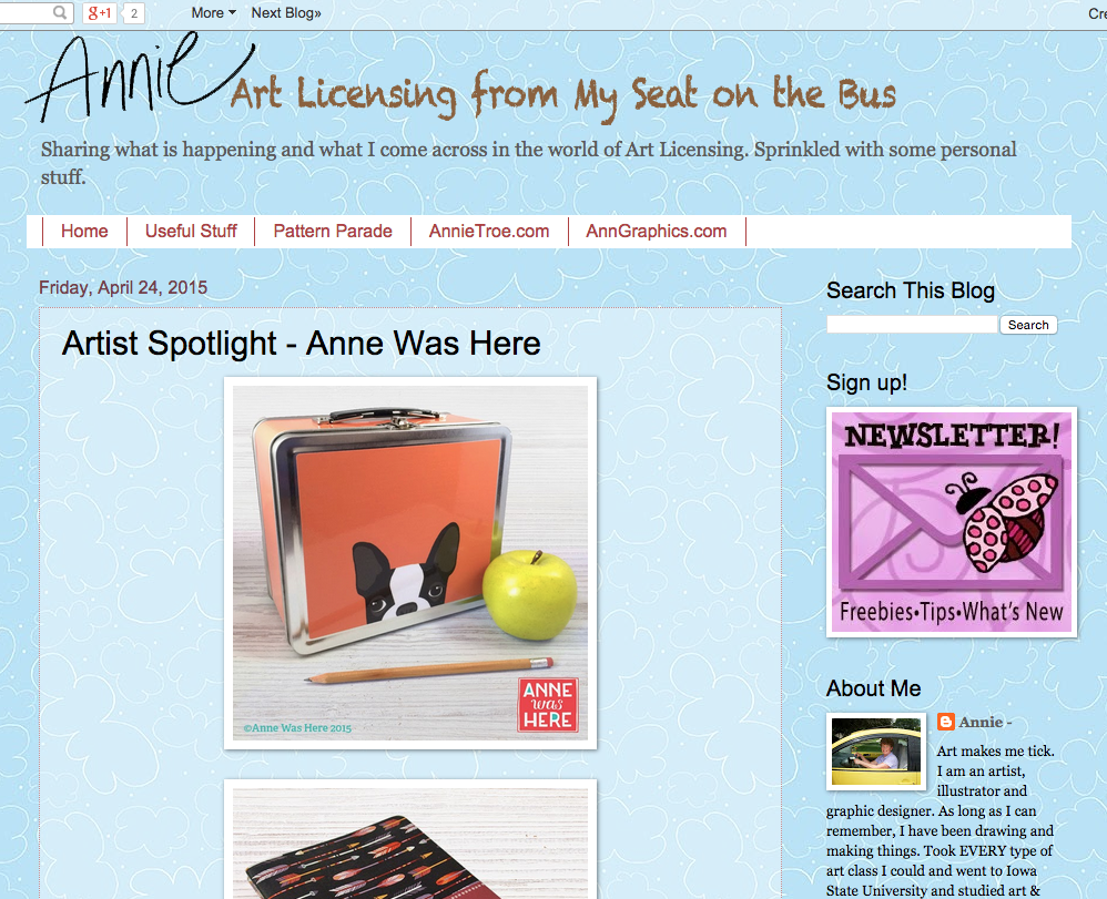
Hello! I'm happy to say that I am featured in Annie Troe's artist spotlight today. I share my background, what I'm working on now and who has helped me along the way. Would love for you to check it out and hear any comments you may have. Happy Friday! You can read the interview here.

Screen Shot 2015-04-24 at 11.17.32 AM

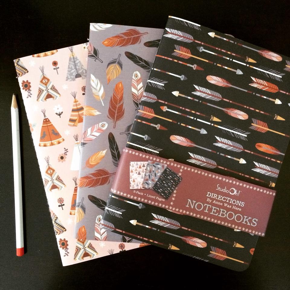
Directions Notebooks for Studio Oh!

This is a notebook set that I licensed to Studio Oh! They make really great products and I am so proud to be working with them. They support/work with many talented independent artists including, Katie Daisy and Helen Dardik. Be sure to check them out! ©Anne Was Here

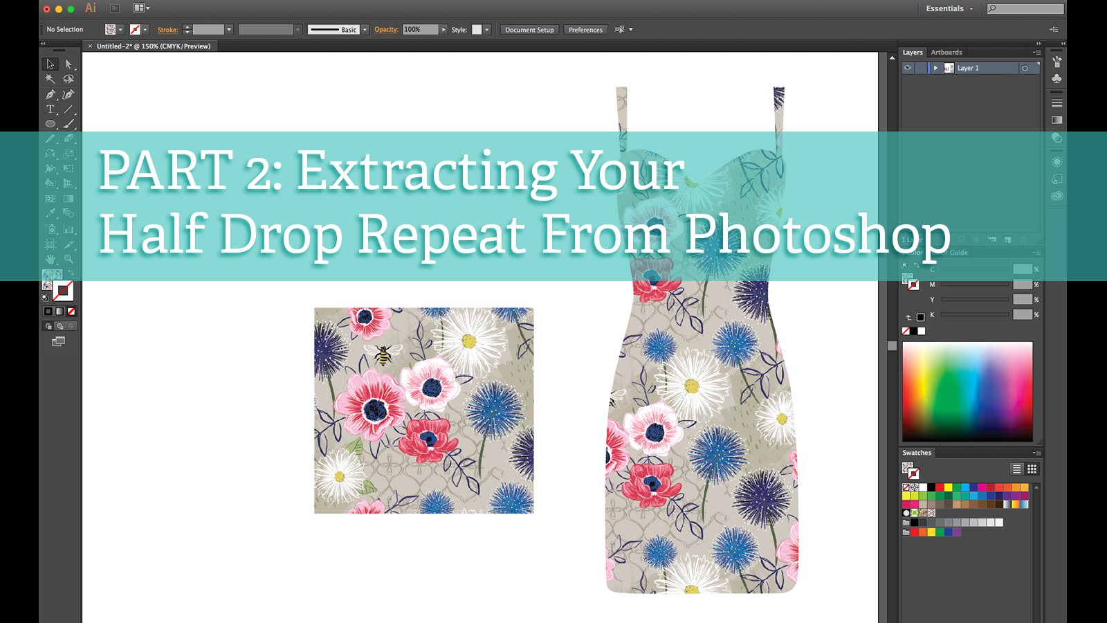
Tutorial: Part 2 - Extracting a Half Drop Repeat from Photoshop

Due to many people asking me the same question, I have created a part 2 to my tutorial on creating a half drop repeat in Photoshop. This second tutorial shows how I extract my seamless pattern tile from my pattern design. Click here for the video.Part2_Cover

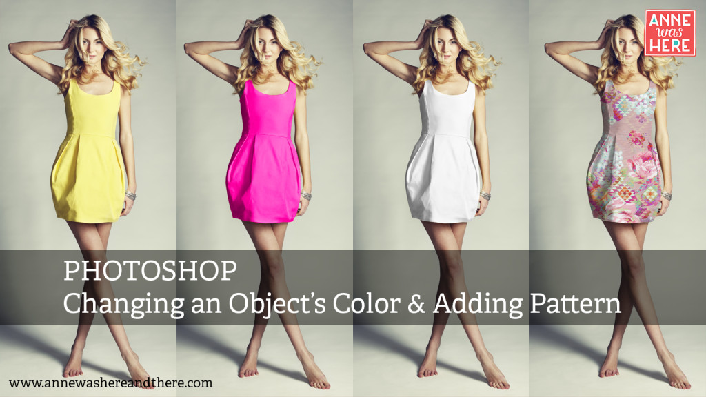
Photoshop Tutorial: Changing an Object's Color and Applying Pattern

New tutorial on my YouTube Channel on how to change an object's color in Photoshop using Gradient Maps. It also shows how to change an object to white and apply pattern. Please subscribe to my channel and like my videos if you enjoy them! This will support me in creating more. Thanks so much! Click here for the video. ©Anne Was Here

Valentine's Day Stationery

I stopped in Homegoods today and was excited to find several of my Valentine's Day designs that I did last year for Molly & Rex. They may also be available at TJ Maxx and Marshalls for a limited time. ©Molly & Rex | Designed by Anne Was Here

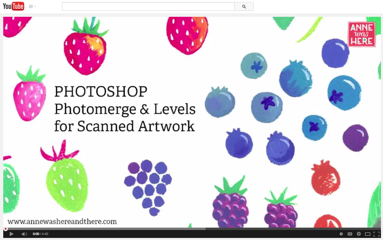
Tutorial: Photoshop Photomerge & Levels for Scanned Artwork

Happy Friday! Brand new free tutorial on my YouTube channel today showing how you can use Photoshop's Photomerge and Levels to stitch together and adjust your hand painted artwork in seconds! Click here to watch. ©Anne Was Here 2015

My First Fabric Collection!

This is something that has been in the works for quite some time but I've had nothing to show for it until now. I am over the moon excited to tell you that I have my first fabric collection, Lady Bug Blooms, available through the fabulous Clothworks! You can see the entire collection online here! The collection will be available starting this summer. I would love to see any creative projects that are completed with it, so please share them with me any quilters and sewers out there! I've got a couple  more collections in the works so stay tuned for more. ©Anne Was Here 2013